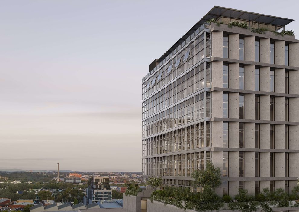
Set the scene of the existing building of Hardie Grant’s new office. What were you working with?
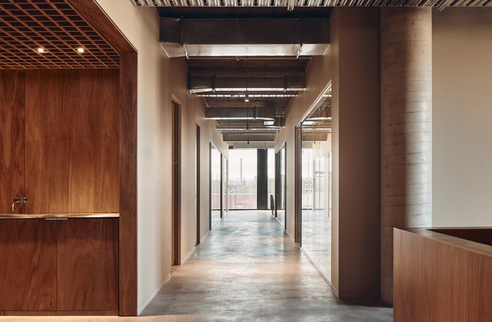
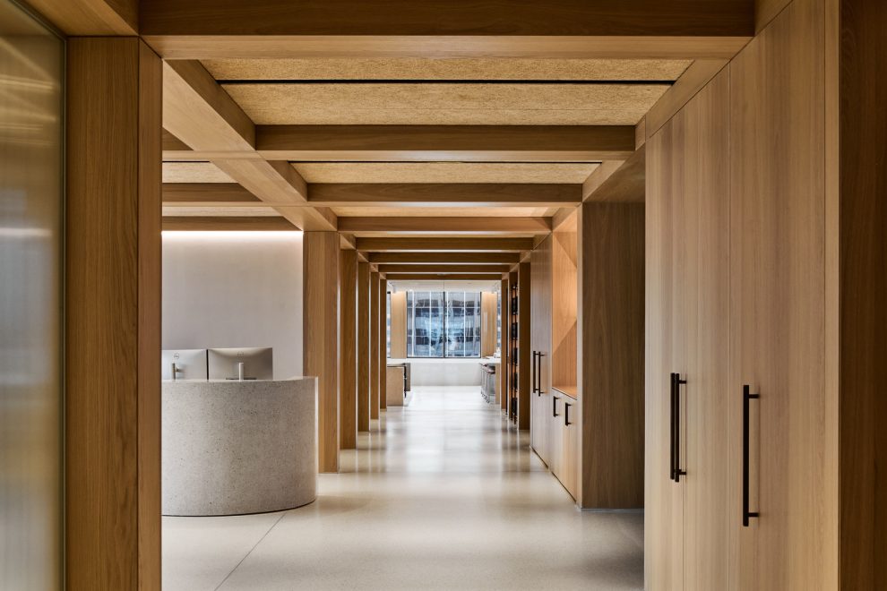
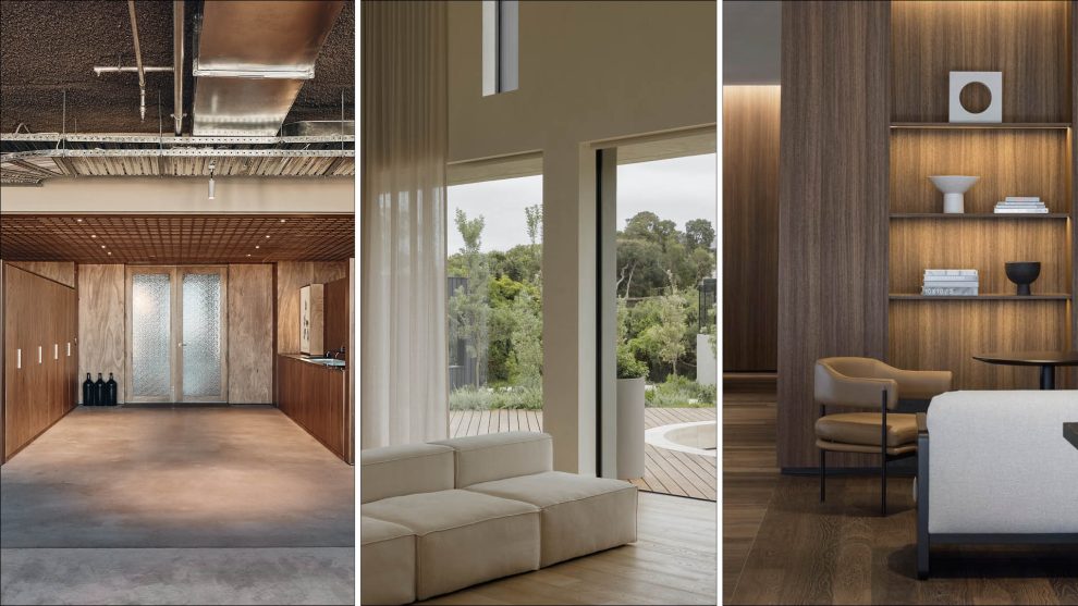
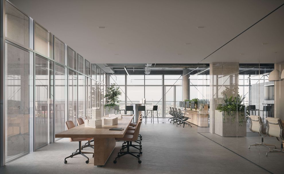
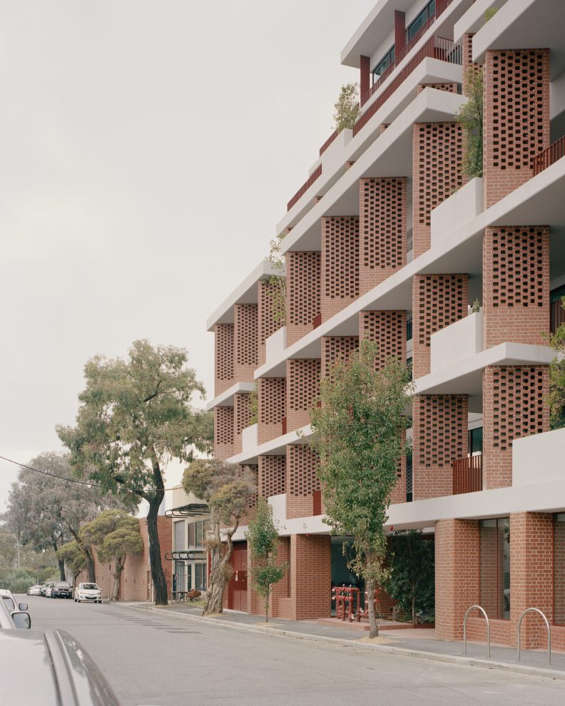
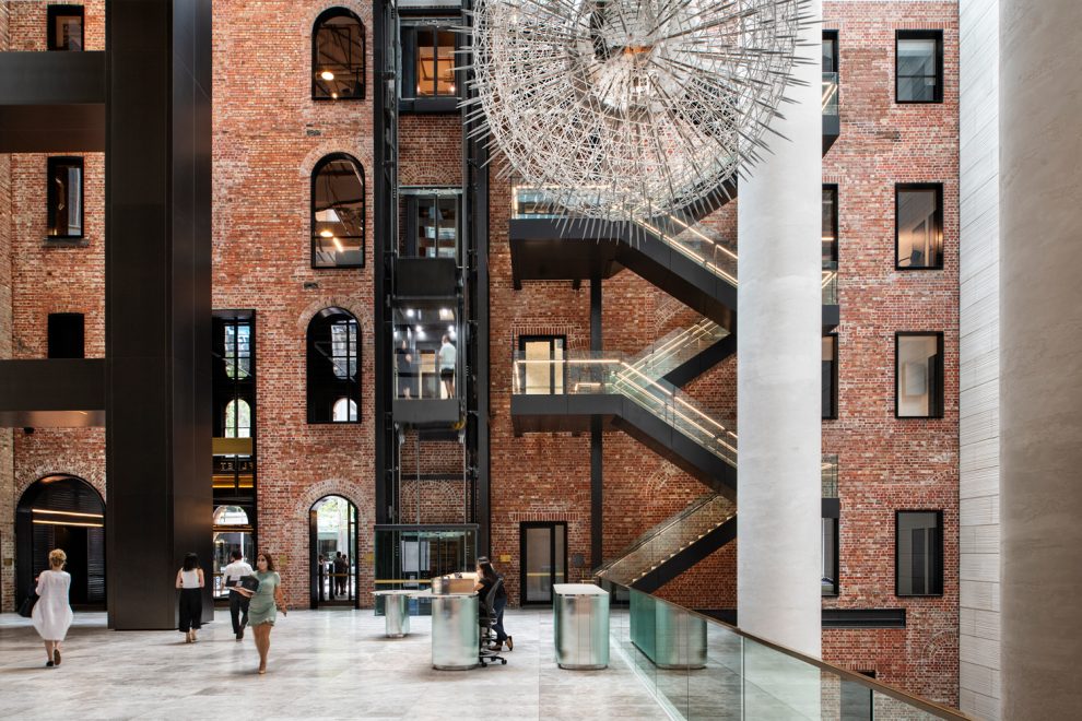
The development we worked with for Hardie Grant’s new workplace is a glue-laminated timber (GLT) building. It’s a timber-structure building with timber columns and slabs, which actually provides a woody smell that is fresh and familiar. The outside has a warm terracotta colour that we wanted to reference in our interior design.
Inside, all the services were kept to a minimum, which made the space feel clean and somewhat already resolved. The building also has good sustainability credentials.
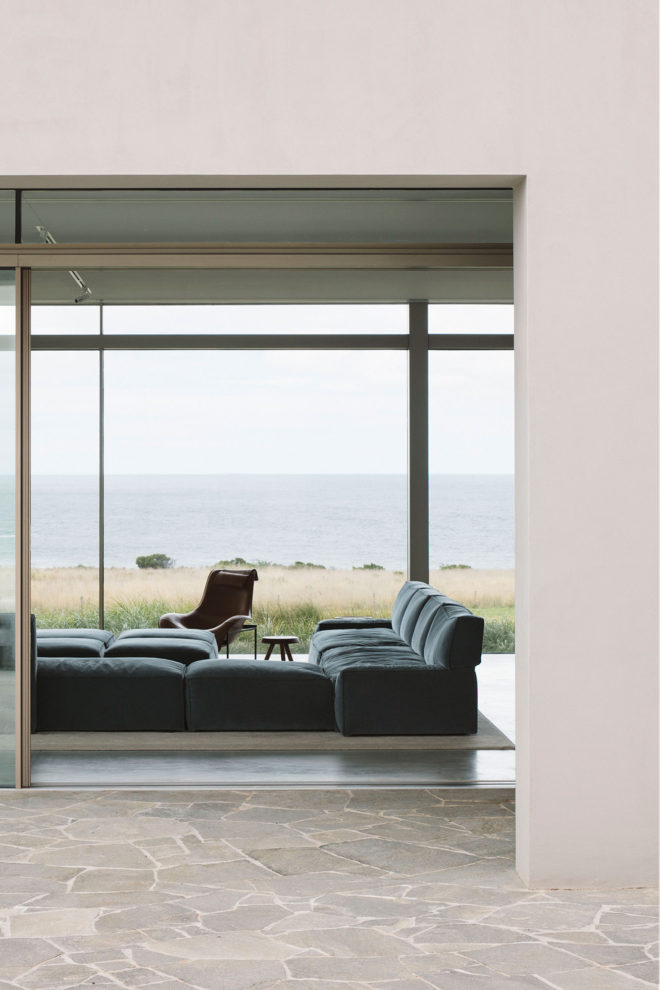
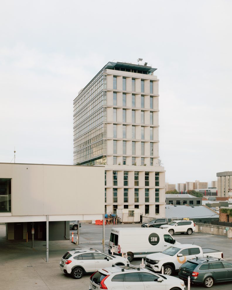
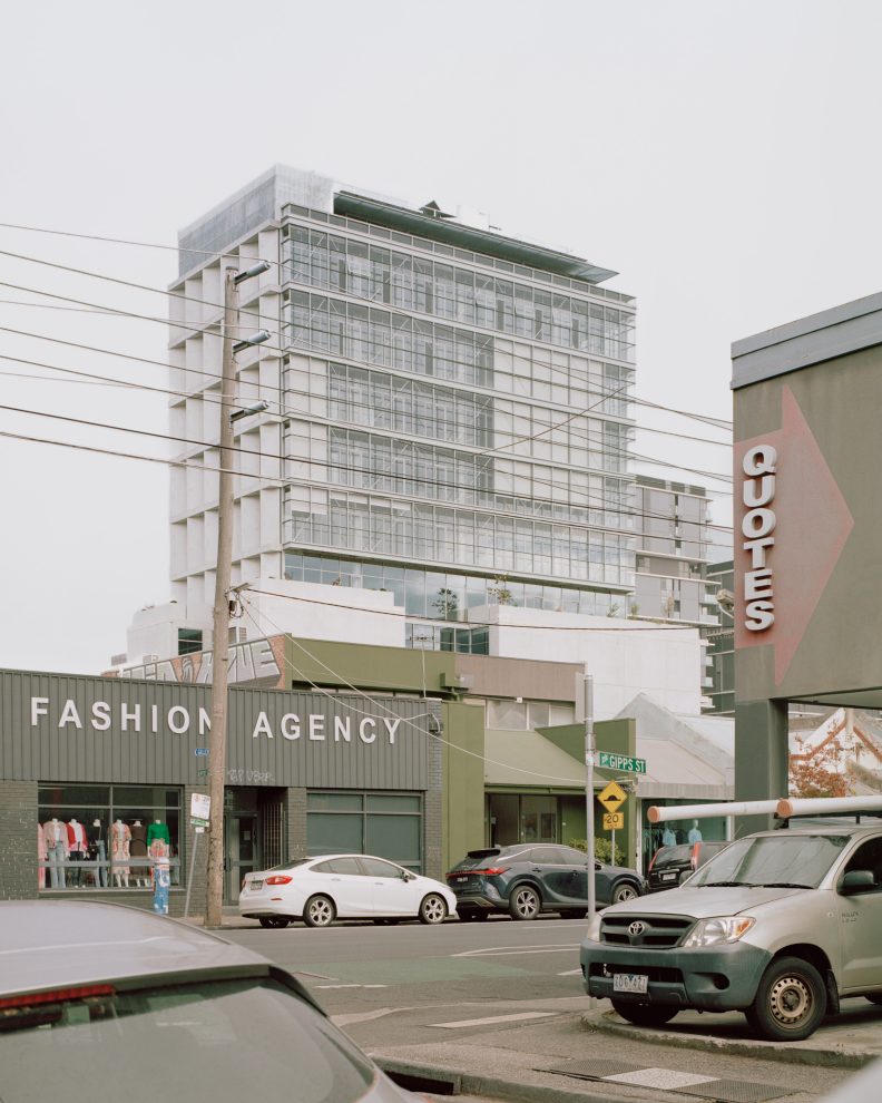
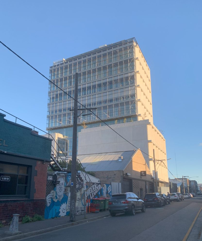
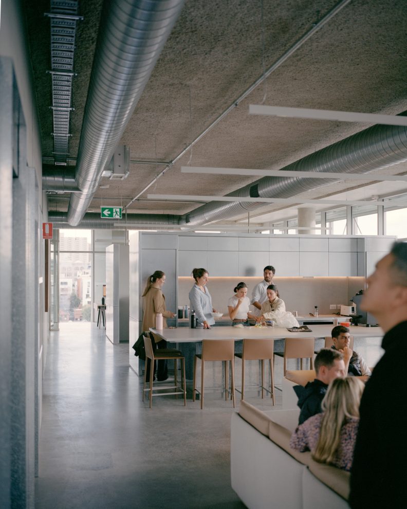
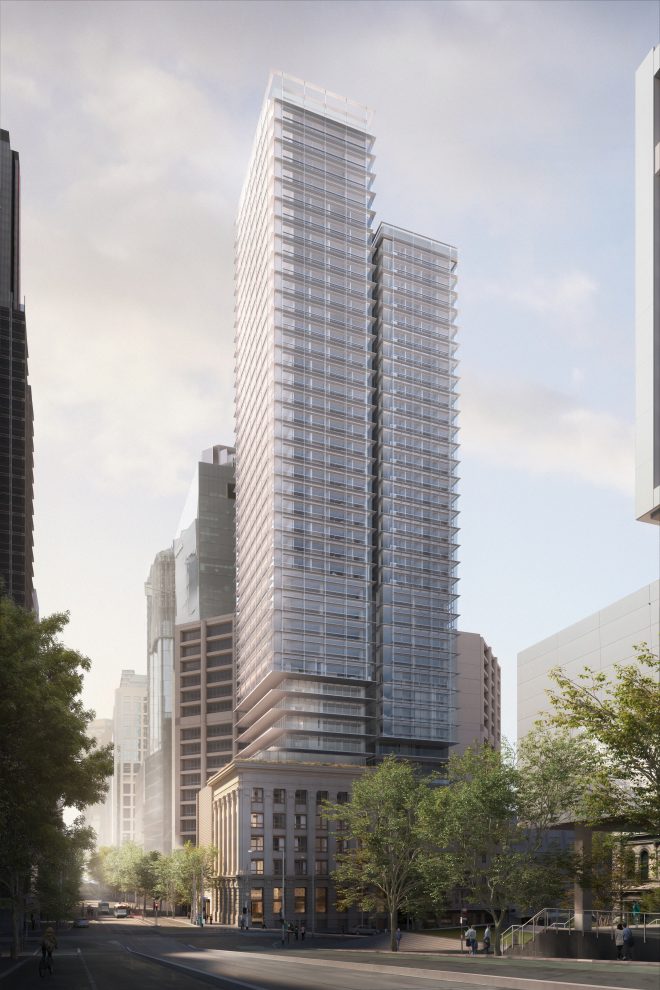
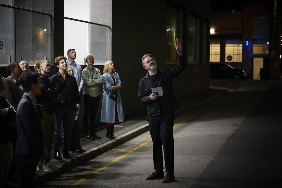
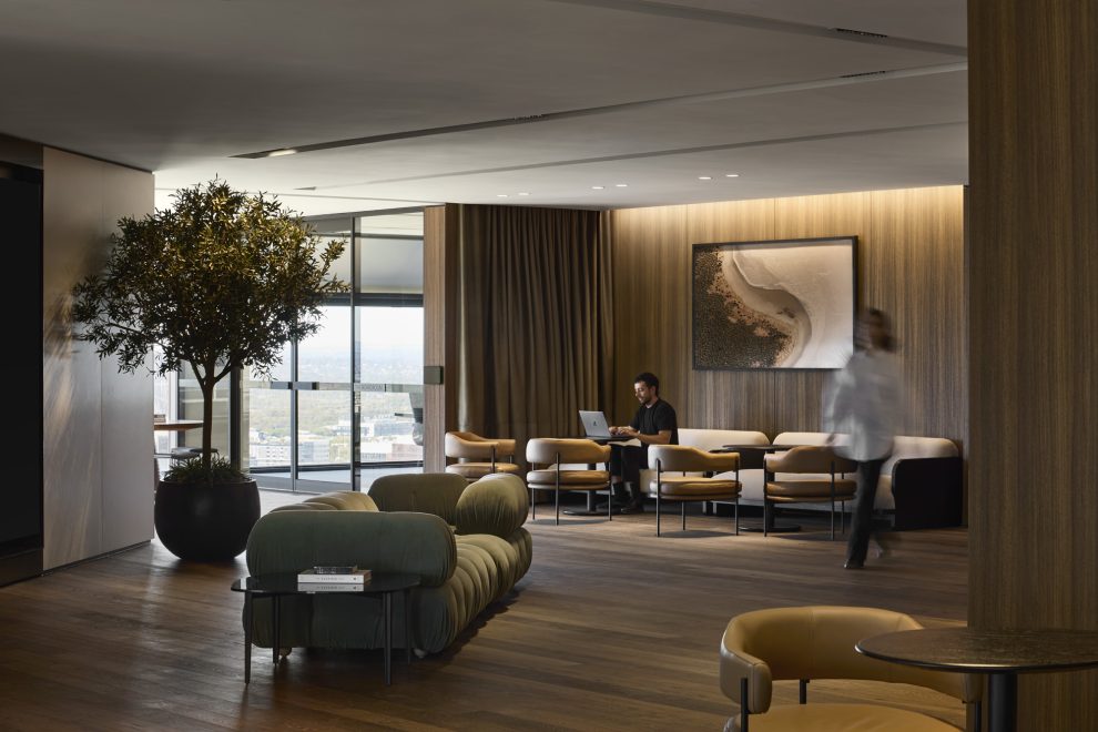
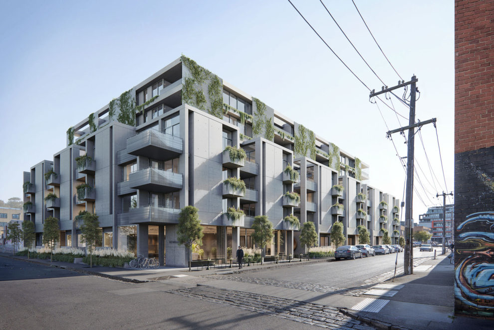
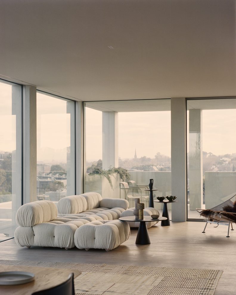
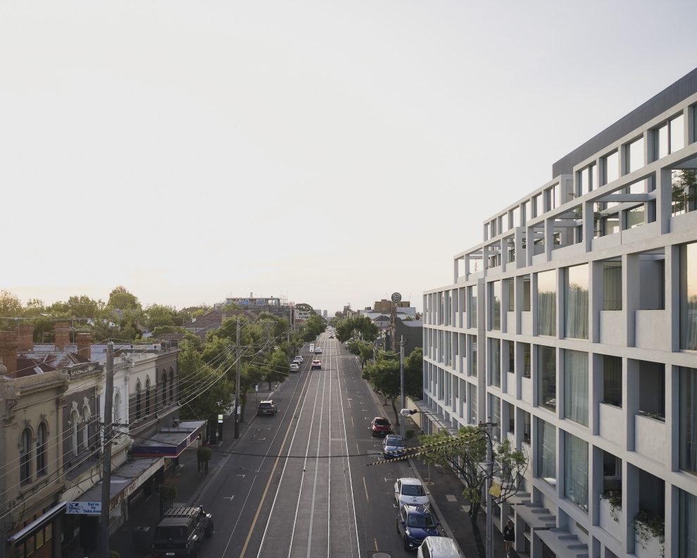
The office is on a full floor in the T3 building in Collingwood, with 360-degree views. Since the surrounding area is mostly low-rise, the views are very impressive. You can see the street art around Collingwood, the city skyline, new developments, and even the Dandenong Ranges in the distance. There’s lots of natural light, which highlights the timber and makes the space feel warm and inviting.
What constraints and opportunities did you initially detect with the base building? How did this inform Carr’s design approach?
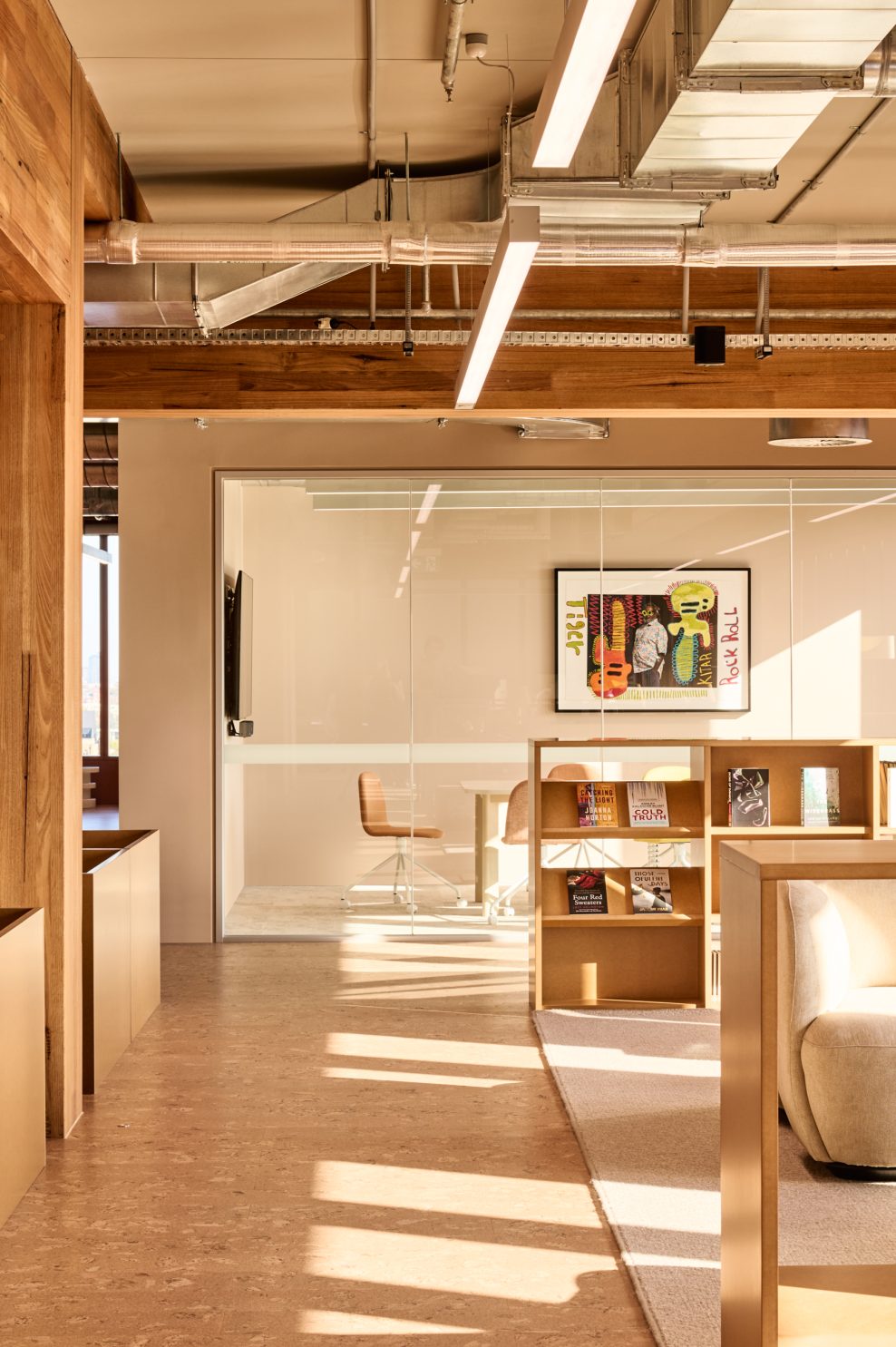
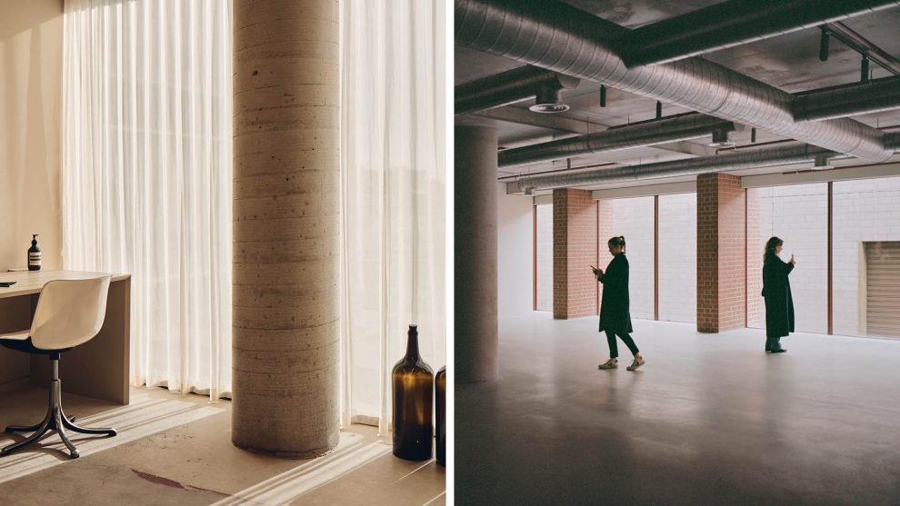
Even though we loved the timber, it was a big constraint. We weren’t allowed to fix into it or drill into the slab, which presented some limitations. It also had weight limits, so areas like the library with lots of books had to be carefully planned to avoid overloading the structure.
To work around it, we pulled everything away from the structure where we could. When we had to build up close, we used oversized shadow gaps to give some breathing room and make those junctions feel intentional.
There was one beam that ran in the opposite direction to the rest. In response, we adjusted the layout around that, too. It’s the kind of thing most people wouldn’t notice, but it really shaped the design.
Being economical across every decision drove many of our design choices. The client also wanted to reuse a lot from their old fit-out, like the green chairs, which fed into the colour choices and materials. It was an incredibly strategic approach that appears effortless and familiar.
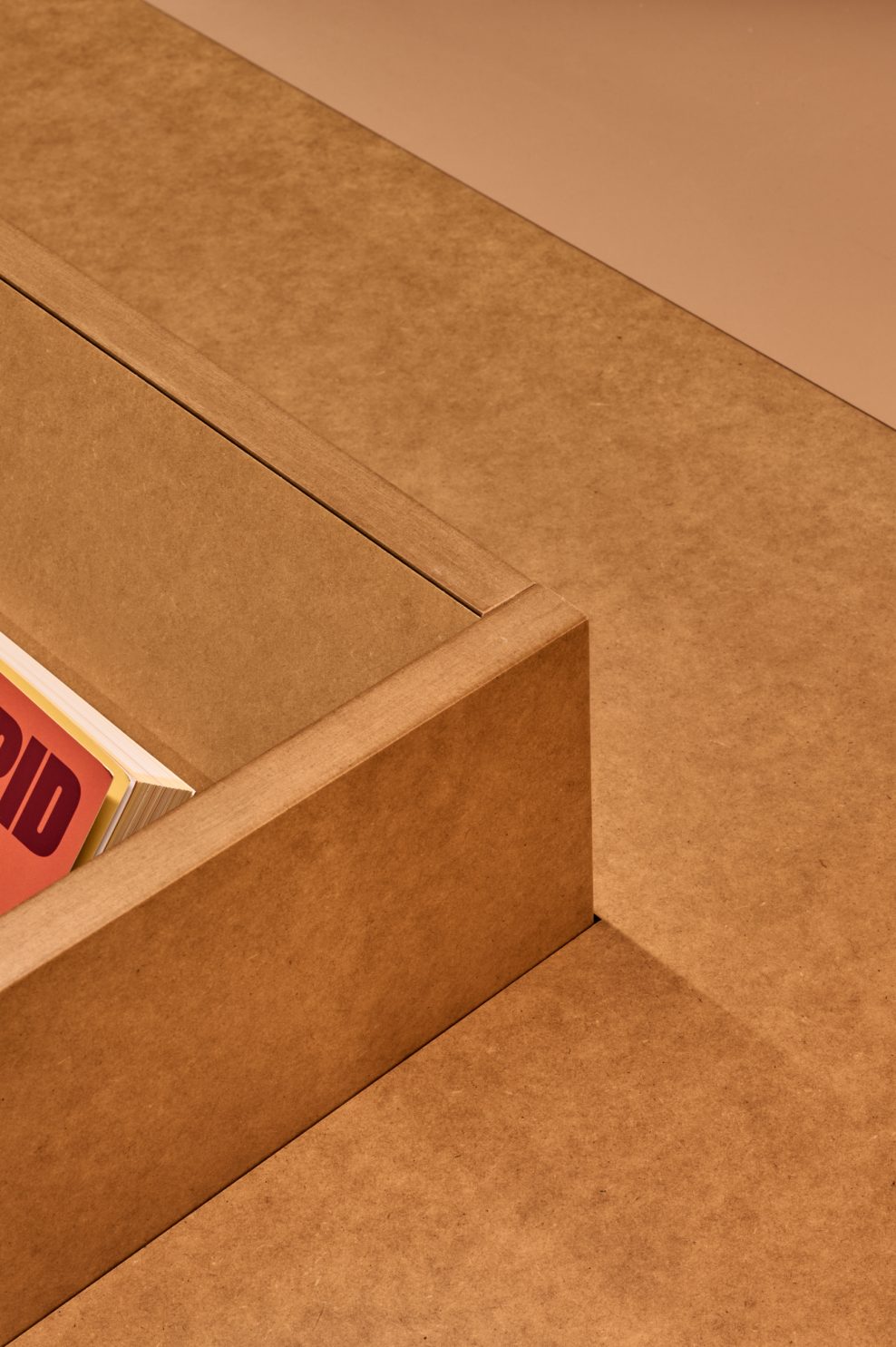
Throughout our design, we used raw medium-density fibreboard (MDF). Can you explain why you selected this material and its benefits?
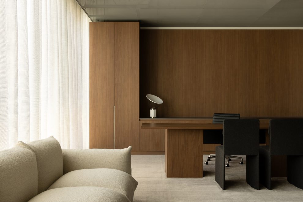
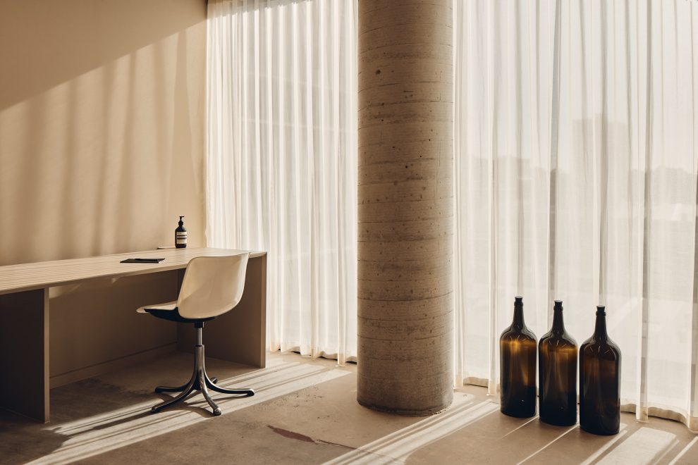
It worked well with our warm, neutral base palette, which was always the direction we were trying to steer the client. They initially wanted something really bright and playful, but we felt it was better to let their publications do the talking. We kept the base calm and neutral.
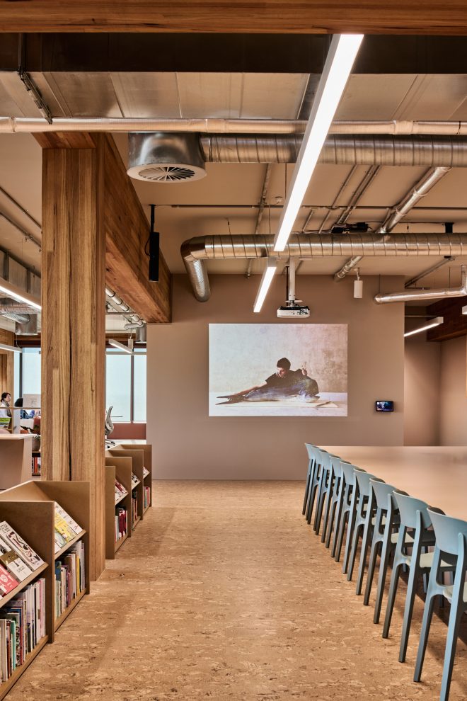
Using raw MDF helped with that. It paired nicely with the cork flooring and has a natural, raw quality we liked. It’s recyclable and reasonably lightweight, which means the modular bookshelves could be moved around easily. It was cost-effective, didn’t need extra treatment or laminates, and gave us the look we were after without overcomplicating the overall aesthetic.
What did you want to celebrate in the design regarding materiality and built form?
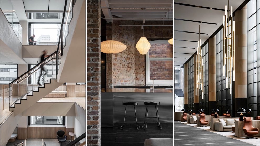
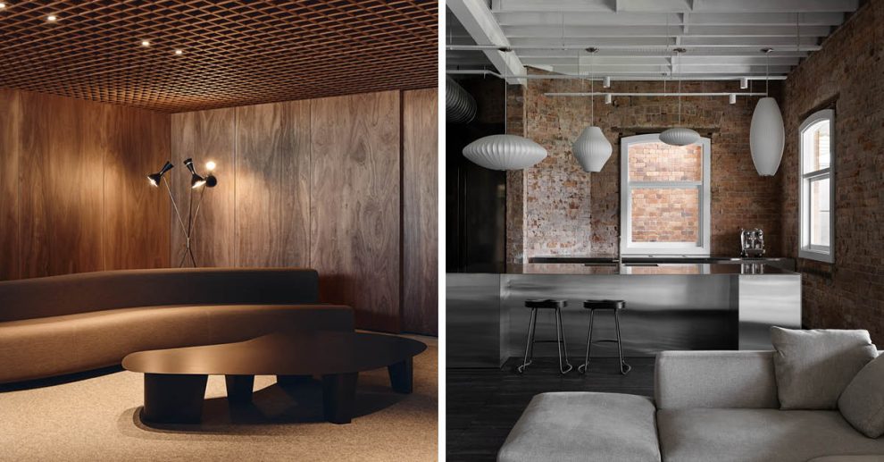
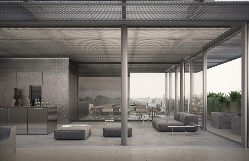
We wanted the built form to sit quietly in the space so the structure and views could take focus. Meeting rooms have glazed fronts to keep them light, and where there are solid sides, we added bookshelves to blend into the library zones.
The timber columns and beams were the heroes, and we used in-floor lighting to highlight them. That was only possible because of the raised floor, which is pretty rare in large-scale commercial buildings.
None of the meeting rooms has a ceiling. We kept the services exposed and reused all the existing lighting, just moved it around to suit the new layout.
We also planned key moments where the layout frames views of the city, street art or mountains — people naturally land at those points and take it in.
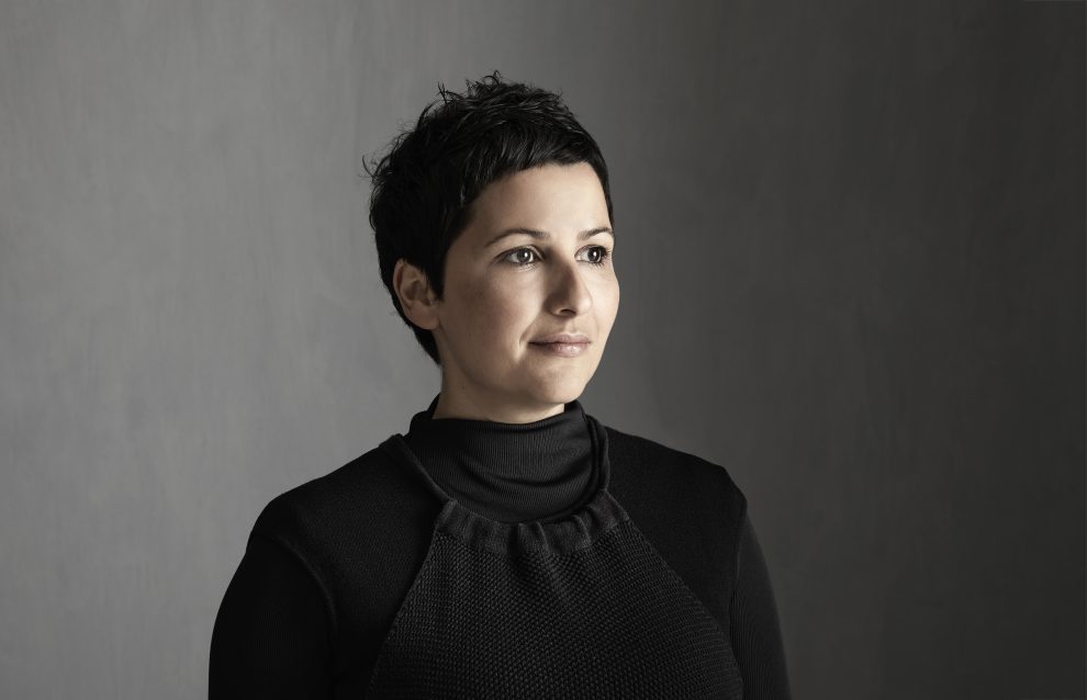
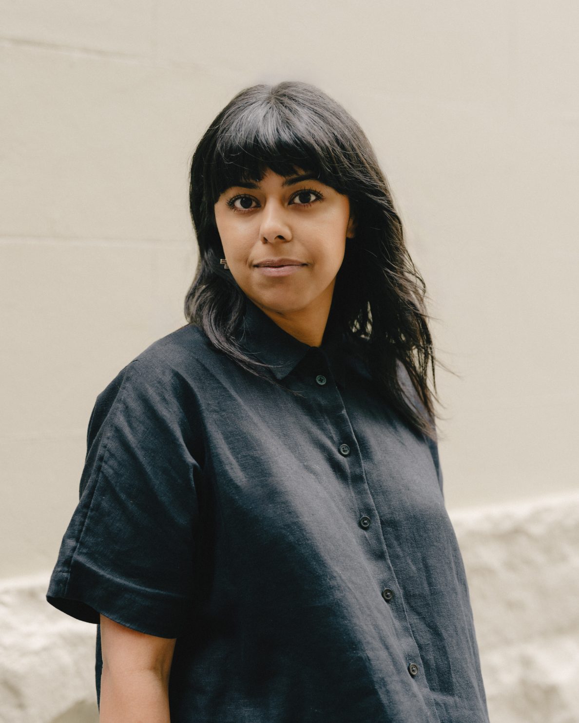
Learn about the strategy behind a custom fit with Catherine Keys.